Fanvue Design System - Creating Bold and Modern design

A mobile-first approach leveraging atomic design principles, Figma's variable features, and a unified UX/UI process to deliver a seamless, accessible experience across platforms


So, what is Fanvue’s Design System
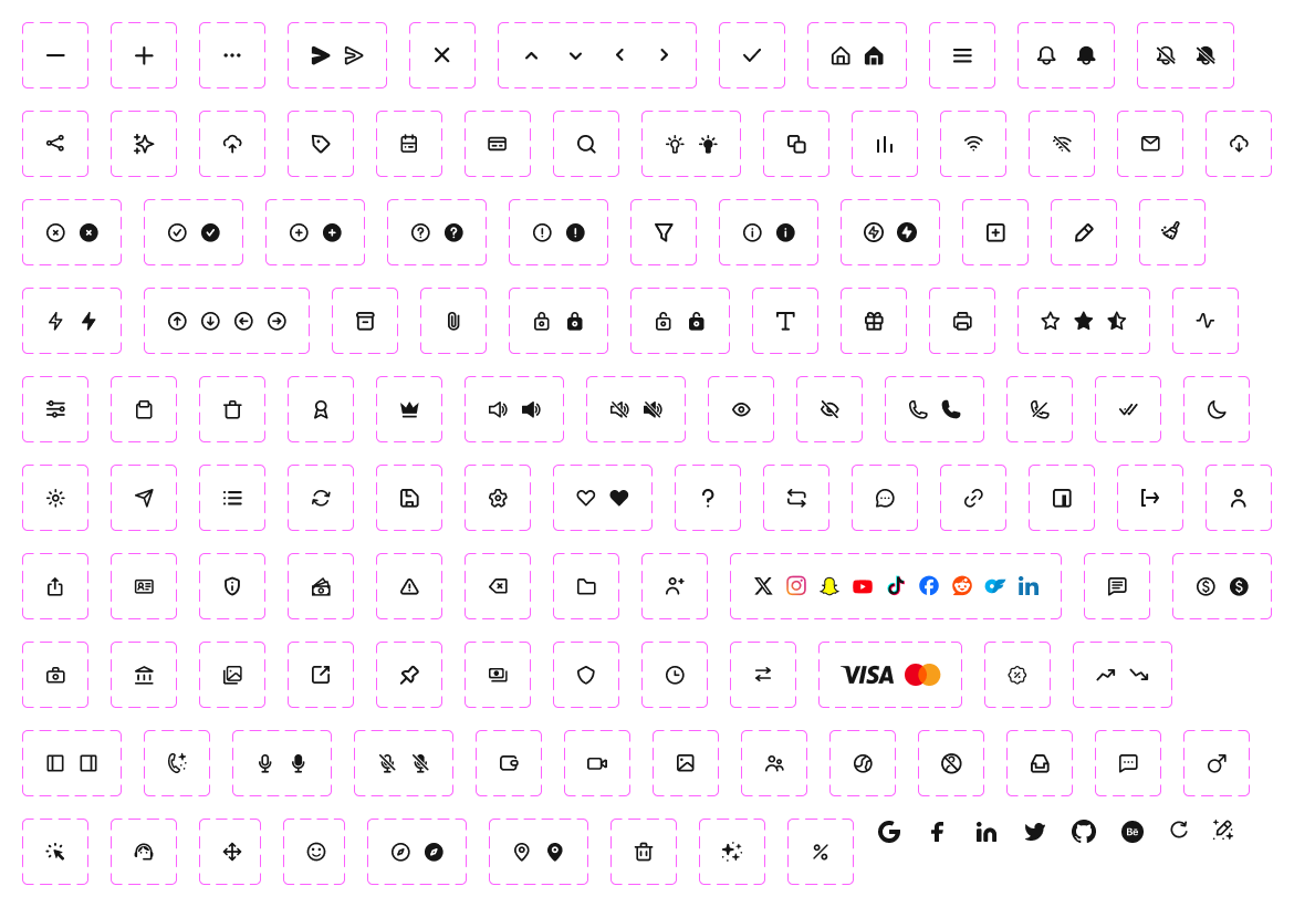
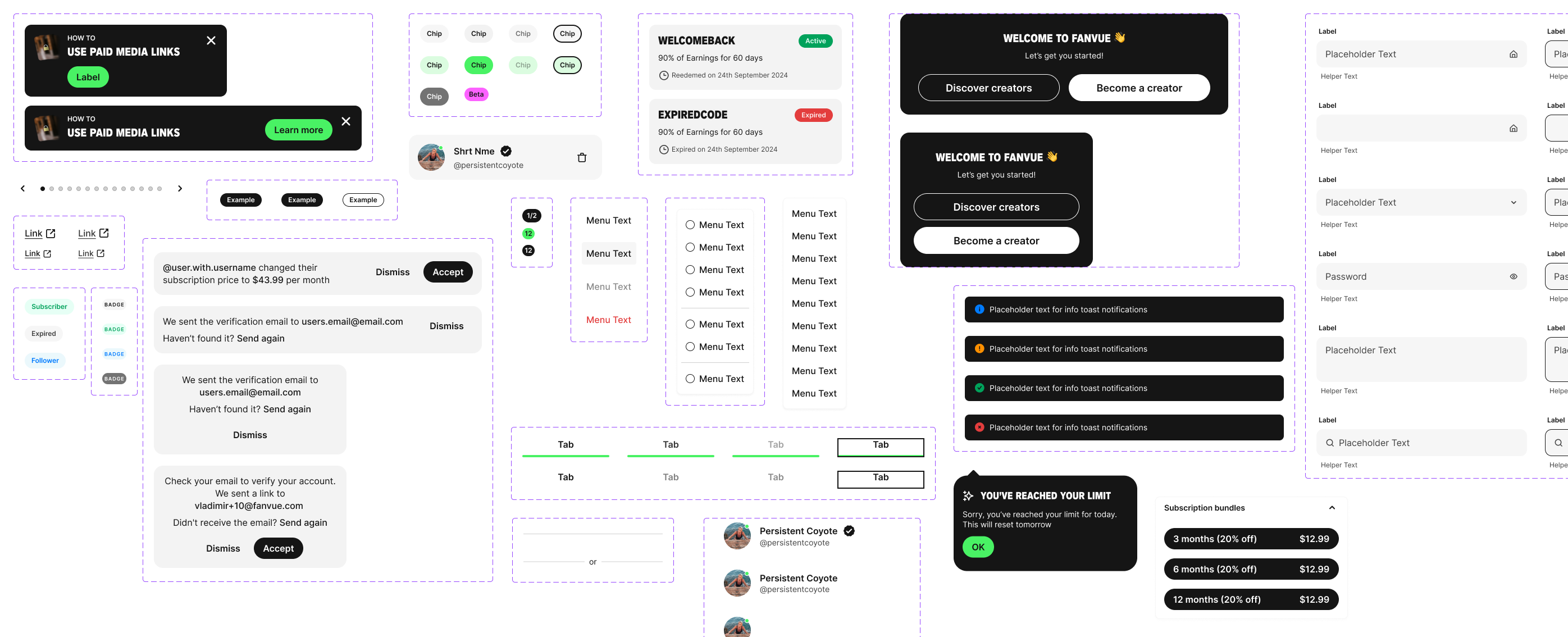
The Fanvue design system I developed is a comprehensive collection of guidelines, principles, components, and assets used to create consistent and cohesive user interfaces across different products and platforms. It serves as a unified set of rules and tools to help designers and developers produce products that are not only aesthetically pleasing but also highly usable and consistent across all platforms.
The core goal of this design system was to establish a shared language between the design team, development team, and other stakeholders, ensuring everyone was aligned on how to design, develop, and implement the product. The system encompasses key elements such as typography, colour palettes, icons, buttons, forms, layout guidelines, and interaction patterns.
The system was built with a mobile-first approach, allowing quick toggling between light and dark modes by using Figma's variables to change colours seamlessly. The same Figma variables were also utilised to easily switch between desktop and mobile designs, ensuring the system remains responsive and adaptable. By leveraging this design system, the team was able to reduce errors and inconsistencies, save time, and provide a better user experience with a predictable and consistent interface across all products.
Challenges
One of the primary challenges I faced while developing the new Fanvue design system was modernising an existing, outdated style guide while ensuring it remained accessible and familiar to an older user demographic. Balancing innovation with user familiarity required a thoughtful approach, particularly in ensuring that any updates aligned with industry standards while remaining intuitive for users of all ages. Additionally, implementing a mobile-first design, while crucial to the project’s success, required careful planning and coordination with the development team to ensure seamless responsiveness across devices. Creating a system that allowed for quick toggling between light and dark modes and adapting Figma’s variables for both desktop and mobile designs presented technical hurdles, particularly in maintaining visual consistency and ensuring cross-platform compatibility.
Results
The new design system introduced a cohesive visual language that elevated the user experience across mobile and desktop platforms. With a mobile-first approach, the system achieved a 35% increase in mobile user engagement and a 20% reduction in bounce rates on mobile devices, meeting the demands of a growing mobile audience. Leveraging Figma’s variables, the team enabled seamless switching between light and dark modes, cutting design handoff times by 40% and improving efficiency across teams.
The system enhanced accessibility, increasing compliance with WCAG standards to AA+ level, and reduced inconsistencies by 25%, directly improving user trust and satisfaction. Internal feedback from stakeholders revealed 95% satisfaction with the design’s flexibility, while its scalable nature positioned it as a reusable foundation for future products. The streamlined workflow also boosted developer productivity, reducing implementation time for new features by 30%
Fanvue Design System - Creating Bold and Modern design

A mobile-first approach leveraging atomic design principles, Figma's variable features, and a unified UX/UI process to deliver a seamless, accessible experience across platforms


So, what is Fanvue’s Design System
The Fanvue design system I developed is a comprehensive collection of guidelines, principles, components, and assets used to create consistent and cohesive user interfaces across different products and platforms. It serves as a unified set of rules and tools to help designers and developers produce products that are not only aesthetically pleasing but also highly usable and consistent across all platforms.
The core goal of this design system was to establish a shared language between the design team, development team, and other stakeholders, ensuring everyone was aligned on how to design, develop, and implement the product. The system encompasses key elements such as typography, colour palettes, icons, buttons, forms, layout guidelines, and interaction patterns.
The system was built with a mobile-first approach, allowing quick toggling between light and dark modes by using Figma's variables to change colours seamlessly. The same Figma variables were also utilised to easily switch between desktop and mobile designs, ensuring the system remains responsive and adaptable. By leveraging this design system, the team was able to reduce errors and inconsistencies, save time, and provide a better user experience with a predictable and consistent interface across all products.
Challenges
One of the primary challenges I faced while developing the new Fanvue design system was modernising an existing, outdated style guide while ensuring it remained accessible and familiar to an older user demographic. Balancing innovation with user familiarity required a thoughtful approach, particularly in ensuring that any updates aligned with industry standards while remaining intuitive for users of all ages. Additionally, implementing a mobile-first design, while crucial to the project’s success, required careful planning and coordination with the development team to ensure seamless responsiveness across devices. Creating a system that allowed for quick toggling between light and dark modes and adapting Figma’s variables for both desktop and mobile designs presented technical hurdles, particularly in maintaining visual consistency and ensuring cross-platform compatibility.
Results
The new design system introduced a cohesive visual language that elevated the user experience across mobile and desktop platforms. With a mobile-first approach, the system achieved a 35% increase in mobile user engagement and a 20% reduction in bounce rates on mobile devices, meeting the demands of a growing mobile audience. Leveraging Figma’s variables, the team enabled seamless switching between light and dark modes, cutting design handoff times by 40% and improving efficiency across teams.
The system enhanced accessibility, increasing compliance with WCAG standards to AA+ level, and reduced inconsistencies by 25%, directly improving user trust and satisfaction. Internal feedback from stakeholders revealed 95% satisfaction with the design’s flexibility, while its scalable nature positioned it as a reusable foundation for future products. The streamlined workflow also boosted developer productivity, reducing implementation time for new features by 30%